
I’ve been having AI agents generate PowerPoint decks for a while now. python-pptx works, the slides come out structurally correct, but there’s a problem: the agent never sees what it made. It writes XML instructions for shapes, text, and layouts, then hands you the file and hopes for the best.
It’s like writing CSS without ever opening a browser. You can get the structure right, but spacing, alignment, and visual balance? Pure guesswork.
So I built a feedback loop. The agent generates slides, renders them to images, looks at the result, and fixes what’s wrong. Getting the rendering part to work on macOS turned out to be more interesting than expected.
What goes wrong without visual feedback
When an agent generates slides blind, the structure is usually fine but the details are off:
- Text overflows placeholder boundaries
- Tables get awkward column widths
- Shapes overlap or sit slightly misaligned
- Color combinations that look fine in hex clash on screen
- Content that needs two slides gets crammed into one
None of these are structural errors. python-pptx doesn’t complain. The XML is valid. You only notice when you open the file and look at it – which is exactly what the agent can’t do.
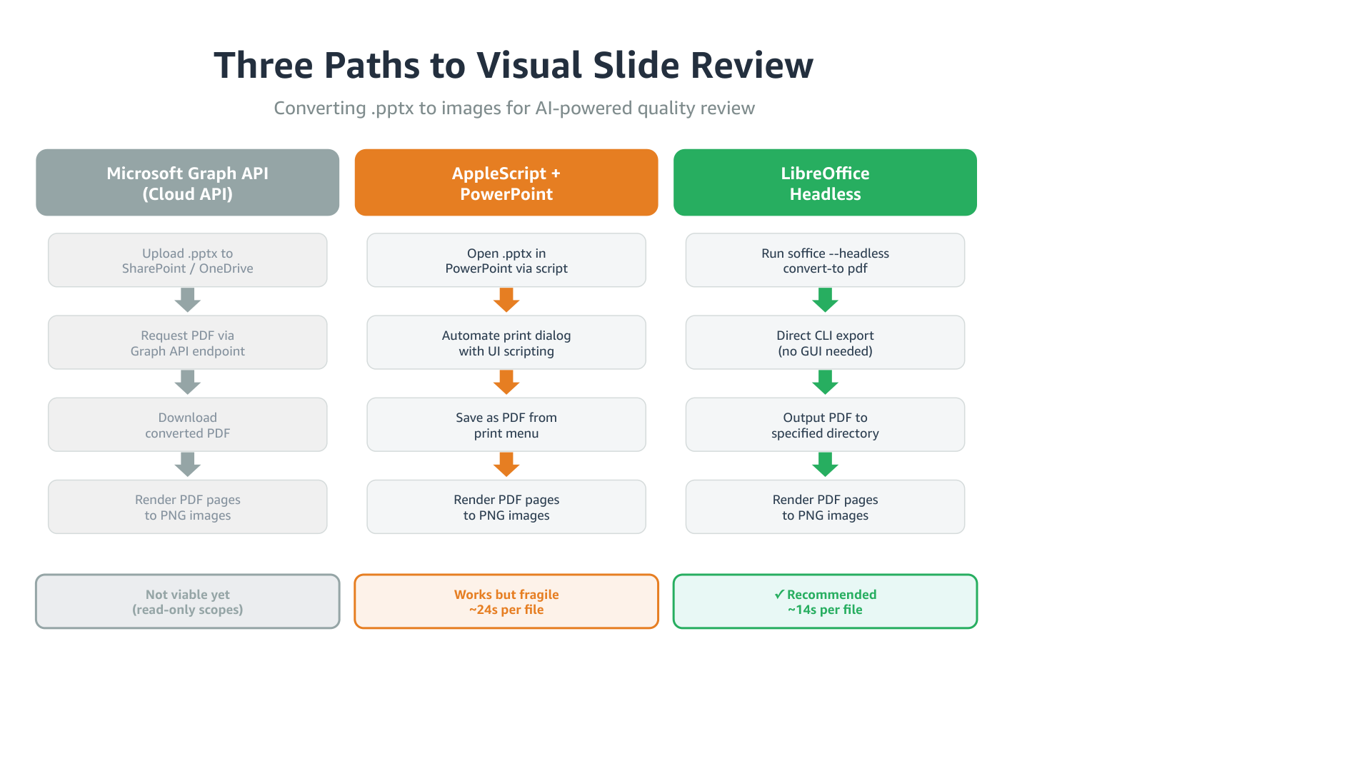
Three ways to turn pptx into pixels
PowerPoint files are complex XML packages. You need a rendering engine that understands PowerPoint’s layout rules to turn them into something a model can see. I tried three approaches.
Cloud API conversion
Microsoft’s Graph API can convert pptx to PDF server-side. Upload to OneDrive, request PDF back. Perfect fidelity, no local software. But it requires write scopes to upload files, and many corporate environments only have read access. Clean solution if your setup supports it, not an option for me yet.
AppleScript + PowerPoint
macOS has “Save as PDF” in every print dialog. PowerPoint is on most corporate Macs. So: automate the print dialog with AppleScript.
PowerPoint’s AppleScript save as PDF command exists in the dictionary but doesn’t actually produce output. The working path was UI automation through System Events – opening the print dialog, clicking the PDF dropdown, navigating the save dialog with keystrokes.
| |
It works. It’s also fragile – the UI element hierarchy changes between PowerPoint versions, the app opens visibly with the print dialog flashing on screen, and it needs Accessibility permissions. About 24 seconds per file.
LibreOffice headless
| |
One command. No GUI, no window, no permissions. About 14 seconds per file. LibreOffice is ~800MB (you can’t install just the converter), but it sits in /Applications doing nothing until you call it.
How they compare
| PowerPoint | LibreOffice | |
|---|---|---|
| Time | ~24s | ~14s |
| Headless | No (GUI flashes) | Yes |
| Fidelity | Reference | Near-identical |
| Dependencies | PowerPoint.app + Accessibility | LibreOffice.app |
| Reliability | Fragile (UI scripting) | Solid (CLI) |
The visual output was nearly identical. The only difference I found was subtle font kerning in headings. For the purpose of an AI checking layout and alignment, both work fine. LibreOffice wins on everything else.
The rendering pipeline
The final setup chains LibreOffice with PyMuPDF:
| |
Six seconds end-to-end for a 4-slide deck. The PNGs are high enough resolution for the model to read text and judge layout.
Blind vs. sighted: the actual difference
I had an agent generate the same slide twice – once without seeing the result, once with the feedback loop. The test was a three-column process flow comparing the conversion methods, with colored headers, step boxes, arrows, and a summary row. The kind of layout where spacing and alignment matter.
Without the feedback loop
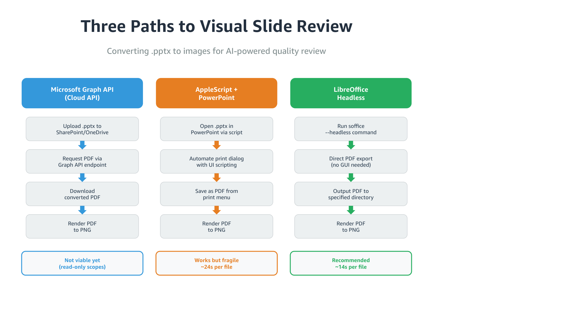
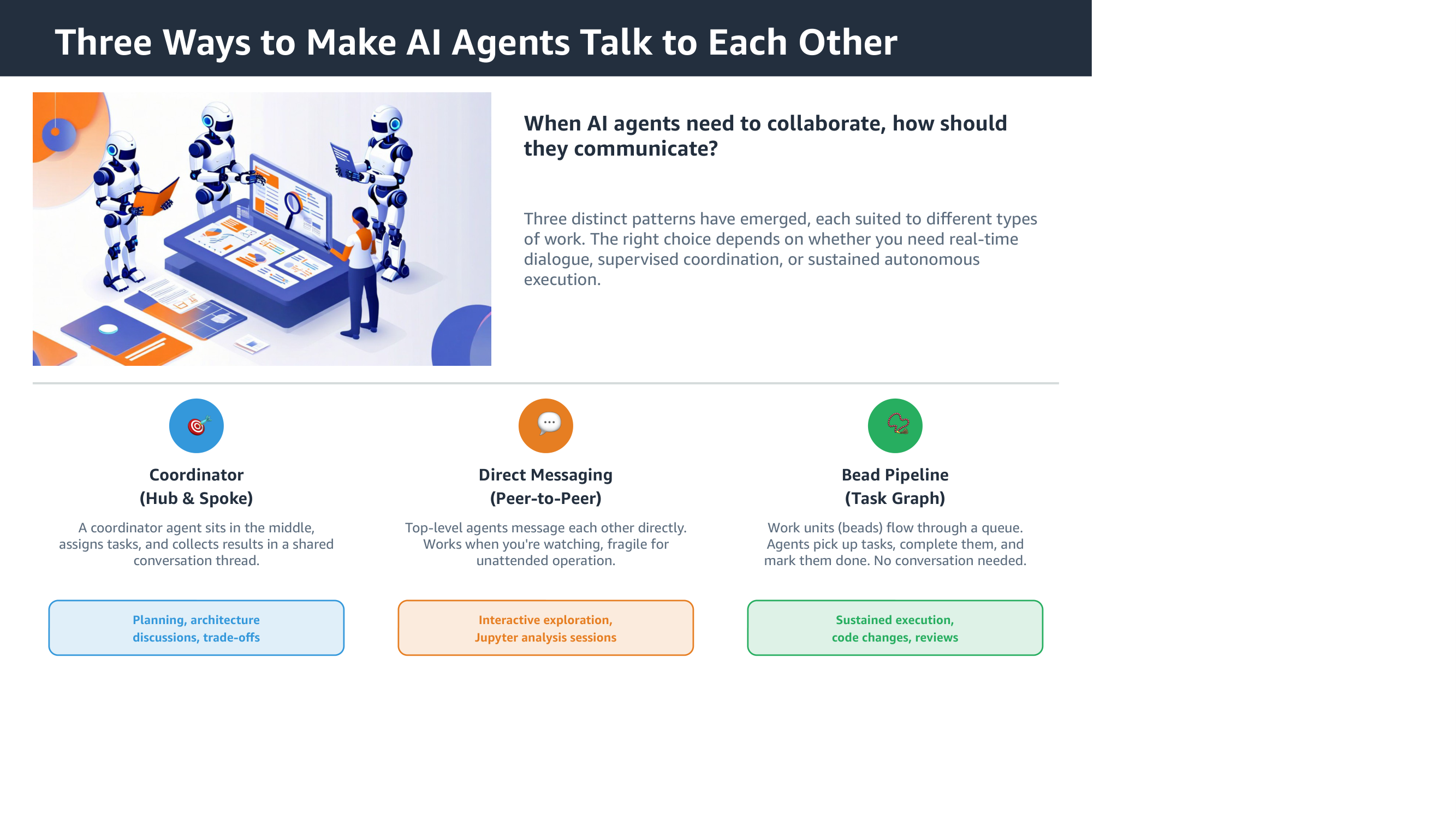
The structure is there. Columns, steps, arrows, summary. But the arrow colors don’t match their column headers. The summary row is plain text instead of styled badges. “Recommended” doesn’t stand out from the others.
On the patterns slide, the icons are generic emoji circles, and the “Best for” labels lack the prefix that makes them scannable.
With the feedback loop
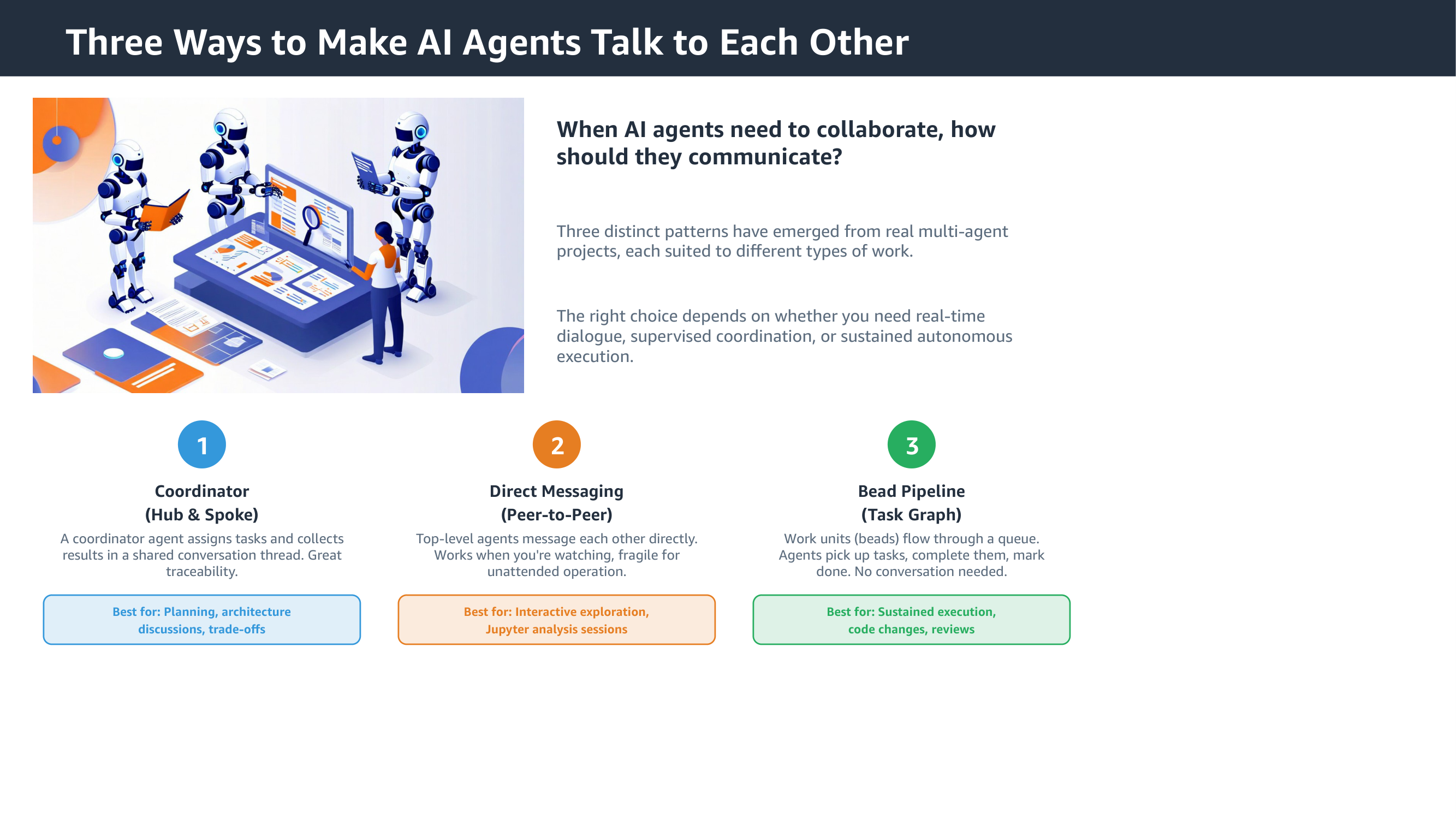
After seeing its own output, the agent fixed the arrow colors to match column headers, added a checkmark to the recommended option, and made the summary badges more distinct. On the patterns slide, it swapped emoji for clean numbered circles and added “Best for:” prefixes.
Each fix is small. Together they’re the difference between “generated by a tool” and “someone actually looked at this”.
How it fits into the agent workflow
This is exposed as a skill file for kiro-cli. When an agent generates a presentation, it:
- Creates slides with python-pptx
- Renders them to PNGs through the pipeline
- Reviews the images
- Fixes what it finds – overflow, misalignment, color issues
- Re-renders and checks again
The agent picks up the capability from the skill file without being told. The review-fix cycle adds about 30 seconds per iteration, which pays for itself in slides that don’t need manual cleanup afterward.
What I’d try next
- Corporate templates with proper layouts and branding – the feedback loop should help even more when the template has strict visual rules
- More complex slides: architecture diagrams, timelines, org charts
- Measuring whether the token cost of visual review pays for itself in reduced human editing
- The Graph API route, once write scopes become available – server-side rendering would drop the local dependency entirely